Tutorial
How to Create Mockups for Etsy Listings in Canva (Free)
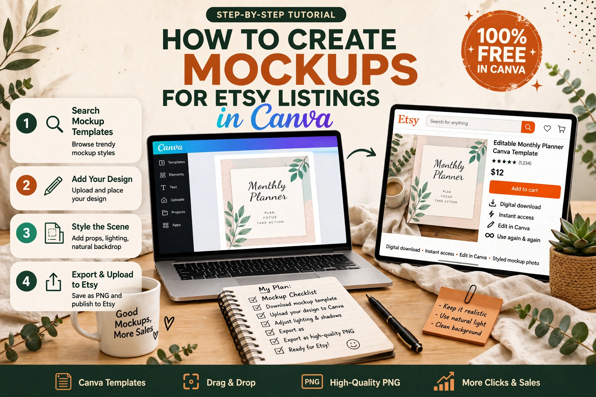
Learn how to create professional Etsy listing mockups in Canva's free plan — device frames, flat-lays and styled scenes, plus the ten images every listing should have.
On Etsy, buyers cannot hold your digital product, flip through it or try it on. All they have is your listing images — and the first image decides whether they click at all. A flat screenshot of a template page tells a buyer almost nothing. A mockup — your template shown on a tablet on a desk, on a laptop screen, or in a styled flat-lay — tells them what it looks like in real life, how it will feel to use, and whether it is worth the price. That is why two listings for the same planner can perform so differently: one shows a screenshot, the other shows the product in use.
The good news is you do not need Photoshop, a camera or a paid mockup site to make good mockups. Canva's free plan can do the whole job: place your design inside a device frame, add a background and a headline, and export a listing image at Etsy's recommended size. This tutorial walks through the full process, from choosing the right mockup style to exporting ten consistent images for one listing, using only free Canva features.
1. What a good Etsy mockup actually does
A mockup is not decoration. It answers the three questions a buyer asks in the first few seconds of looking at a listing:
- What is this, exactly? A planner mockup on a tablet instantly says "digital planner for tablet use". A flat screenshot of the same file could be a printable, a wall poster or a slide deck — the buyer has to guess.
- What will it look like when I use it? Seeing a weekly spread filled in with realistic plans, on a device, next to a stylus, lets the buyer picture themselves using it. Blank pages do not do that; a filled-in example does.
- Is this worth the price? A polished, consistent set of images signals a finished, professional product. A single blurry screenshot signals the opposite, however good the file itself is.
That is also why mockups matter more for digital products than for physical ones. A physical seller can photograph the real item. You cannot — the mockup is your product photograph, and it deserves the same care.
2. Before you open Canva: pick your mockup style
There are three mockup styles that work for almost every digital product, and you should pick one as your shop's house style and stick with it. Consistency across listings is what makes a shop look like a brand instead of a collection of unrelated files.
| Style | Best for | How it looks |
|---|---|---|
| Device mockup | Digital planners, journals, workbooks, e-books | Your pages shown on a tablet, phone or laptop screen, on a desk or plain background |
| Flat-lay mockup | Printable planners, worksheets, wall art, invitations | Your pages laid out flat, viewed from above, with props such as a pen, coffee cup or plant |
| Styled scene mockup | Social media templates, Canva templates, presentation templates | Your template on a screen in a realistic setting — a desk, a studio, a workspace — with soft light and a few props |
For a digital planner, use a device mockup. For a printable, use a flat-lay. For a social media or Canva template, use a styled scene. Mixing all three styles in one listing confuses buyers; using one style across your whole shop builds recognition, so a returning buyer spots your listings in search at a glance.
Decide on two more things before you start: your background colour and your headline font. Keep the background the same across your listings — white, cream or one soft colour — and use the same font for the short headline on your first image. Those two choices alone make ten different products look like one shop.
3. Set up the right size in Canva (free plan)
Etsy recommends listing images of 2700 x 2025 pixels (a 4:3 ratio), and it requires a minimum of 2000 pixels on the shortest side for the zoom feature to work. A listing image smaller than that looks soft when a buyer zooms in — exactly when they are deciding whether to buy.
In Canva's free plan, custom sizes are a Pro feature, so use this workaround, which every free-plan seller uses:
- Start from a design at a 4:3 ratio. A presentation slide (16:9) is the wrong shape; instead, create a design using the "Poster" or "Presentation" starting point and resize by eye, or simply start from a blank design and build at a landscape ratio that matches 4:3 — the exact pixel size matters less than the ratio, because Etsy will display it at 4:3.
- Better still: search Canva's templates for "Etsy listing" or "Etsy banner" and pick a free template at the right landscape ratio, then replace its content with your own. Free templates marked with a crown are Pro; skip those and use the unmarked ones.
- Keep every listing image at the same ratio. Etsy crops inconsistently sized images in search results, and a cropped headline or a cut-off tablet edge is the most common avoidable mockup mistake.
One practical note: Canva's free plan exports JPG and PNG at good quality for this size. Export as JPG for listing photos — the file is smaller, uploads faster, and Etsy compresses images anyway, so PNG's extra size buys you nothing here.
4. Method A: Make a device mockup with a frame (the easiest route)
Canva has built-in device frames that do the hard work for you. This is the fastest route to a professional planner or e-book mockup, and it needs no photo at all.
- Export your product pages as images. In your product design, download the two or three pages you want to show — a cover page, a filled-in weekly spread and a monthly page work well — as PNG or JPG files. Use pages filled with realistic example content, not blank templates: a weekly spread with actual plans written in looks like a product, while a blank spread looks like a file.
- Start a new landscape design at your listing ratio and set the background colour: plain white, soft cream or one muted colour that matches your brand. Avoid busy patterns behind a device mockup; the product should be the only thing competing for attention.
- Add a device frame. In the Elements panel, search for "tablet mockup", "laptop mockup" or "phone mockup" and choose a free frame. Drag your exported page image onto the frame — Canva will drop it into the screen area automatically. Adjust the image inside the frame so the page fills the screen without cropping the headline or the edges.
- Arrange the composition. Place the device slightly off-centre, leaving room at the top or side for a short headline such as "Digital Weekly Planner" or "2027 Budget Planner". Keep the headline to five words or fewer: the image should be readable as a thumbnail in search, where it appears very small.
- Add one or two supporting elements, no more. A second, smaller device behind the first, a stylus beside the tablet, or a small badge saying "Hyperlinked" or "For iPad & Android" adds context. Three or more extras turn a product photo into a collage and bury the product itself.
- Export as JPG and check it at thumbnail size before you upload it. Shrink the image down on your screen until it is the size of an Etsy search thumbnail: if you can still read the headline and recognise the product, it passes. If not, shorten the headline or enlarge the device.
If you are making the planner itself in Canva, our tutorial on how to create a digital product in Canva, start to finish covers page sizes and exporting, and our guide to creating a Canva template step by step covers the design side in more detail.
5. Method B: Make a flat-lay mockup from a stock photo
Flat-lays suit printables: worksheets, wall art, invitations and printable planners. The trick is to start from a real photograph, not a blank background, because the photo supplies the realism that a flat design cannot.
- Find a free stock photo. In Canva's Photos panel, search for "desk flat lay", "planner desk" or "workspace top view" and pick a clean, bright photo with an empty area where your pages can sit. Free photos in Canva are free to use in your listing images; avoid photos with visible brand logos or other sellers' products in them.
- Place your page images on top of the photo. Drag your exported page images onto the design and rotate them very slightly — a page at a perfect right angle looks pasted on, while a tilt of two or three degrees looks placed on a desk. Keep the tilt subtle; a page at 20 degrees looks careless, not natural.
- Add a soft shadow. Canva does not have a one-click shadow for images, but you can fake one: duplicate the page image, fill the copy with a dark grey, blur it slightly using the Effects panel if available, and place it just behind and below the original. Even a simple dark rectangle with low transparency behind the page lifts it off the background and stops it looking pasted on.
- Keep props in the photo, not added on top. The stock photo already has a pen, a coffee cup or a plant in it. Adding extra illustrated props on top of a photograph clashes with the realism you are trying to create. Let the photo do the styling; your job is the product pages.
- Check the edges. Zoom in and make sure no page edge is cut off awkwardly by the frame and no white border from your export is showing around the page. A thin white edge around a page on a wooden desk is the tell-tale sign of a pasted mockup, and buyers notice it even when they cannot name what is wrong.
6. Method C: Build a styled scene mockup for templates
Social media templates, presentation templates and Canva templates sell on style, so the mockup should show the template in a setting that matches its use: an Instagram template on a phone held in a bright room, a presentation template on a laptop on a clean desk. The method is a mix of the two above — a stock photo scene, plus your template placed on the screen.
- Pick a scene photo with one clear screen or surface: a laptop on a desk, a phone in a hand, a tablet on a table. Scenes with two screens or a busy background split the buyer's attention.
- Place your template image over the screen area and use Canva's corner handles to skew it to the screen's angle. Take your time here: a template that sits square on a tilted laptop screen looks wrong instantly, while a template matched to the screen's perspective looks photographed.
- Add a short headline in your brand font, placed where it does not cover the template itself — usually the top or bottom of the image, on the plain part of the photo.
- Use the same scene style for every template in a set. If your Instagram templates all use bright desk scenes and your presentation templates all use minimal office scenes, a buyer browsing your shop can tell the product lines apart at a glance.
7. The ten images every Etsy listing should have
Etsy allows ten images per listing, and most successful digital-product listings use most of them. A buyer who has seen only one angle has unanswered questions; a buyer who has seen ten has usually already decided. Plan your ten before you start making them:
- Hero mockup. The product in use, with a short headline. This is the thumbnail, so it carries the most weight.
- Second angle. A different mockup style or device — for example, the planner on a phone as well as a tablet — showing the product works across devices.
- Inside spread. Two or three pages side by side, so buyers see the range of layouts, not just the cover.
- Feature close-up. One feature at large size: hyperlinked tabs, a budget tracker filled in, a habit tracker in use. Name the feature in a small label on the image.
- What's included. A simple graphic listing everything in the file: page count, sizes, formats, devices. Buyers read this image more carefully than the description.
- How it works. Three steps in one image: buy, download, open on your device. This answers the beginner's first worry — "will I actually be able to use this?"
- Size and format. The page size, file format and app it works with (GoodNotes, Notability, Canva, PDF reader), shown plainly. This prevents the most common refund reason: buying the wrong format.
- Variations or colours. If the product comes in colour options, show them together in one image instead of spreading them across images.
- Example filled in. A page completed with realistic content — a week actually planned, a budget actually filled in — because buyers buy the finished feeling, not the blank grid.
- Thank-you or brand image. A simple closing image with your shop name and a note about instant download. It costs nothing to make and it ends the listing on a professional note.
You do not need ten different mockups: images 3 to 5 can reuse the same device mockup with different pages inside it, and images 5 to 7 are simple text graphics made in the same design file. Make the first design, duplicate it nine times, and change only the content in each copy — that keeps fonts, colours and spacing identical across the set, which is exactly what consistency means in practice.
8. Common mockup mistakes that cost clicks
| Mistake | Why it hurts | Fix |
|---|---|---|
| Blank pages in the mockup | Buyers cannot tell what the product does | Fill every shown page with realistic example content before exporting |
| Headline covering the product | The thumbnail shows text, not the product | Move the headline to empty space; shorten it to five words or fewer |
| Different styles across listings | The shop looks unplanned and untrustworthy | Fix one background colour, one headline font and one mockup style, and reuse them |
| Low-resolution exports | Zoom shows blur, and buyers assume the file is low quality too | Export at the largest size Canva free allows and check the zoom yourself |
| Too many props or badges | The product disappears behind decoration | One device, one headline, at most two extras — then stop |
| Using another seller's mockup photo | Copyright risk and a possible listing takedown | Use only Canva's free stock photos and frames, or photos you took yourself |
One more rule that matters for digital products specifically: never show a feature the file does not have. If your planner is not hyperlinked, do not add a "Hyperlinked" badge to the mockup. A mockup that promises a feature the buyer does not receive is the fastest route to a one-star review, and reviews are harder to fix than images.
FAQ
Can I really make good mockups on Canva's free plan?
Yes. Device frames, free stock photos, text and image placement are all free. The main free-plan limits are custom export sizes, background removal and some premium templates and photos — none of which you need for a good listing mockup if you use the workarounds in this tutorial: a 4:3 ratio design, free frames and free photos, and JPG export.
Do I need ten images, or will three do?
Three will list, but ten sell better. Each extra image answers a question that would otherwise stop a buyer: what is included, what format it is, how it works, what it looks like filled in. If you are short on time, make the hero mockup, the what's-included graphic and one filled-in example first, then add the rest over the following week.
Should the mockup show my template on a real device photo or a Canva frame?
Either works, and most beginners should start with Canva frames because they are faster and perfectly aligned. Real device photos look slightly more natural, but only if the template is matched to the screen's perspective carefully — a badly skewed template on a real photo looks worse than a clean frame mockup.
Can I use mockups from a mockup website instead?
Yes, if the licence allows commercial use in listings — many free mockup sites do, and some paid ones are inexpensive. The advantage is realism; the disadvantage is that every other seller using the same free mockup looks the same. Canva frames plus your own colour and headline choices give you a more distinctive shop look for no cost.
What size should I export for Etsy?
Aim for 2700 x 2025 pixels (4:3) and never below 2000 pixels on the shortest side, so Etsy's zoom works. Export as JPG, check the image at thumbnail size, and check the zoom yourself after uploading — if it looks soft, re-export larger rather than hoping buyers will not zoom.
Do mockups help outside Etsy too?
Yes. The same hero mockup works as a Pinterest pin image, a Gumroad product thumbnail and a preview on your own site. Make the mockup once, in your house style, and reuse it everywhere the product appears — that consistency is what turns a single product into a recognisable brand.
Your mockup checklist
- House style chosen: one mockup style, one background colour, one headline font for the whole shop
- Listing ratio fixed at 4:3, with exports at 2000 pixels or more on the shortest side
- Hero mockup made: product in use, headline of five words or fewer, readable at thumbnail size
- Pages shown filled with realistic example content, never blank
- Ten-image plan covered: hero, second angle, inside spread, feature close-up, what's included, how it works, size and format, variations, filled-in example, brand image
- Every image checked at thumbnail size and at full zoom before upload
- No feature shown or claimed that the file does not actually have
- Only free Canva stock photos and frames, or your own photos — nothing copied from another seller
Start with your best-selling product, not your newest one. Make its ten images in your house style this week, then reuse that design file as the template for every other listing. A shop where every listing looks like it came from the same maker is a shop buyers trust — and trust is what turns a click on a mockup into a sale.
If you are building the product itself as well as its mockups, start with our tutorial on creating a digital product in Canva, start to finish, and if you sell on Etsy, read how to sell Canva templates on Etsy for listing titles, tags and pricing to go with these images. To see how a finished planner should feel in use, try our free Budget Planner Pro — it is a good reference for what a filled-in, usable planner looks like before you mock up your own.